


TailwindCSS is not a new framework but rather a CSS utility library that assists coders in creating websites and apps faster. It helps you manage the appearance of your elements and iterate on changes with ease. It is easy to use, intuitive and accessible to beginners. Tailwind comes with pre-built components that can be used right away or as an inspiration for your own implementation. You can use it on any existing project, and it will not add any additional load time. This article covers everything you need to know about TailwindCSS so you can start using it right away.
What is TailwindCSS?
Tailwind is a utility-first CSS framework that uses the concept of utility classes to accelerate your workflow. The framework is lightweight, has a small footprint, and loads very quickly, making it the perfect option for your projects. It is an ideal solution for websites of all types, from blogs to eCommerce stores. Unlike other CSS frameworks with a massive library of styles, Tailwind is a focused toolkit. It is created for developers with a focus on simplicity and ease of use, and it doesn’t require any predefined structure within your project.
How to Install Tailwind?
Before you start using Tailwind, you first need to install it in your project. Or you can use the Play CDN to try Tailwind right in the browser without any build step, and You can do this by adding the Play CDN script tag to the <head> of your HTML file and start using Tailwind’s utility classes to style your content.
Add the Play CDN script to your HTML
<script src="https://cdn.tailwindcss.com"></script>
<!doctype html>
<html>
<head>
  <meta charset="UTF-8">
  <meta name="viewport" content="width=device-width, initial-scale=1.0">
  <script src="https://cdn.tailwindcss.com"></script>
</head>
<body>
  <h1 class="text-3xl font-bold underline">
    Hello world!
  </h1>
</body>
</html>
Try customizing your config
You can also edit the tailwind.config object to customize your configuration with your design tokens.
<script>
    tailwind.config = {
      theme: {
        extend: {
          colors: {
            myBlue: '#2827CC',
          }
        }
      }
    }
  </script>
<!DOCTYPE html>
<html lang="en">
<head>
  <meta charset="UTF-8">
  <meta name="viewport" content="width=device-width, initial-scale=1.0">
  <script src="https://cdn.tailwindcss.com"></script>
  <script>
    tailwind.config = {
      theme: {
        extend: {
          colors: {
            myBlue: '#2827CC',
          }
        }
      }
    }
  </script>
</head>
<body>
  <h1 class="text-3xl font-bold underline text-myBlue">
    Hello world!
  </h1>
</body>
</html>
How to use CSS flexbox in tailwindcss?
The flex feature enables you to create a responsive layout for various screen sizes. This means that different screen sizes will display your content differently. This feature is helpful for situations where you want to create a layout that adapts to different screen sizes. For example, if you create a layout for your website’s article section, you can use the flex feature to create a layout that fits the article’s content.
For flex-direction, it uses the below class:
flex-row class in tailwindcss used for flex-direction: row;flex-row-reverse class in tailwindcss used for flex-direction: row-reverse;flex-col class in tailwindcss used for flex-direction: column;flex-col-reverse class in tailwindcss used for flex-direction: column-reverse;
For flex-wrap, it uses the below class:
flex-wrap for the property flex-wrap: wrap;flex-wrap-reverse for the property flex-wrap: wrap-reverse;flex-nowrap for the property flex-wrap: nowrap;
Flex
Utilities for controlling how flex items both grow and shrink.flex-1 can have property flex: 1 1 0%; in tailwind.flex-auto can have property flex: 1 1 auto; in tailwind.flex-initial can have property flex: 0 1 auto; in tailwind.flex-none can have property flex: none; in tailwind.
How to use Hover, Focus in tailwindcss?
The hover and focus features allow you to create a hover-based action that appears when a user hovers over an element. This feature is helpful for situations where you want to add an action to an element that is not clickable. For example, if you want to create a hover-based effect on your website’s logo, you can use the hover feature. You can use it anywhere as per your choice.
Each utility class in Tailwind can be applied conditionally by adding a modifier to the start of the class name that defines the condition you want to target.
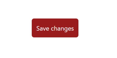
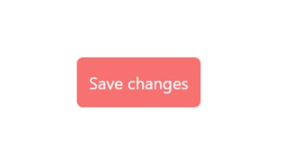
For example, if you want to apply the bg-red-400 class on hover, use the hover:bg-red-400 class:
<button class="bg-red-800 hover:bg-red-400">
  Save changes
</button>
Before hover:
After Hover:
<!doctype html>
<html>
<head>
  <meta charset="UTF-8">
  <meta name="viewport" content="width=device-width, initial-scale=1.0">
  <script src="https://cdn.tailwindcss.com"></script>
</head>
<body>

  <div class="flex items-center justify-center h-screen">
    <button class="bg-red-800 hover:bg-red-400 p-3 text-white rounded-md">
      Save changes
    </button>
  </div>

</body>
</html>
Some of the modifiers that Tailwind includes:
Pseudo-classes, like :hover, :focus, :first-child, and :required
Pseudo-elements, like ::before, ::after, ::placeholder, and ::selection
There are many more in Tailwindcss; you can explore the Tailwind Docs for more classes.